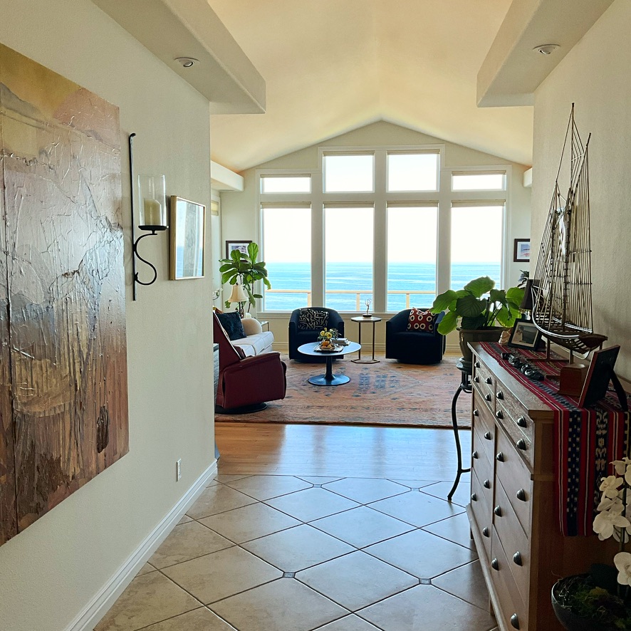
The entryway serves as the first impression of our home, offering a glimpse into our personal story and setting the tone for the rest of the space. But how do we transform a dated entry without changing the flooring or undergoing renovations?
We paint and decorate!
The Goals
Create an entry that feels inviting.
Minimize the visual impact of the floor tile.
Add furnishings and art to create a pathway that draws visitors inside.
The Challenges
Floor tile is circa 2011 with yellow/beige undertones.
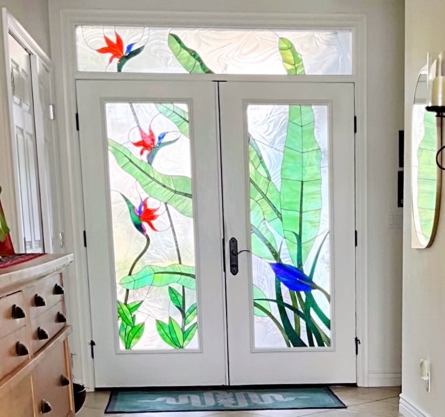
Wood tone of the door frame is not showcasing the custom stained glass doors.
Overpowering peach colored walls.
The entry feels barren and uninteresting.
The homeowner does not want a runner rug. It would have to be custom made at 4′ wide X 16′ long.
It is dated, but has potential!
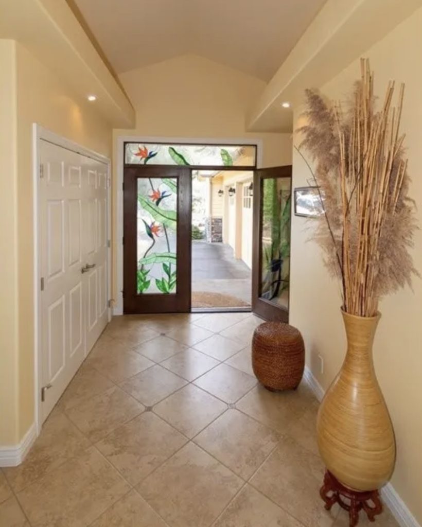
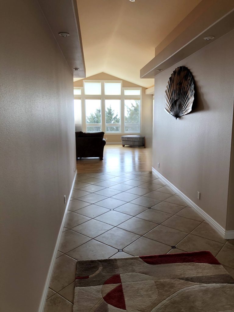
When walking through the front doors, you are immediately drawn towards the view and the windows in the living room.
How do we create an exciting pathway to get there?
The Solutions
Address the paint colors.
Integrate the builder grade yellow beige floor tiles with repetition in other areas.
Showcase the stained glass front doors.
Create visual interest and continuity in both directions with art furnishings, lighting and decor.
Before
First, paint.
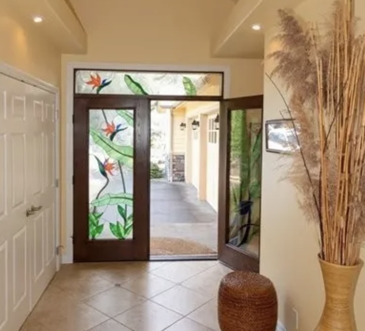
After
The front door frames were painted the same white as the trim and interior doors.
Now the stained colors in the glass pop.
Wall Color: Swiss Coffee
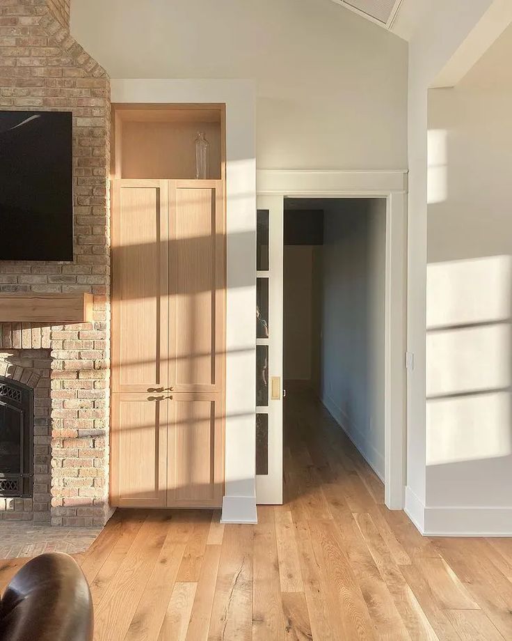
We needed a neutral that coordinated well with the yellow/beige tile and yellow wood tone of the living room floor.
We chose Benjamin Moore’s Swiss Coffee as the perfect choice. It changes in the shifting light throughout the day from a warm cream to light latte and compliments the floor, furniture and art.
Now, Let’s Furnish & Decorate
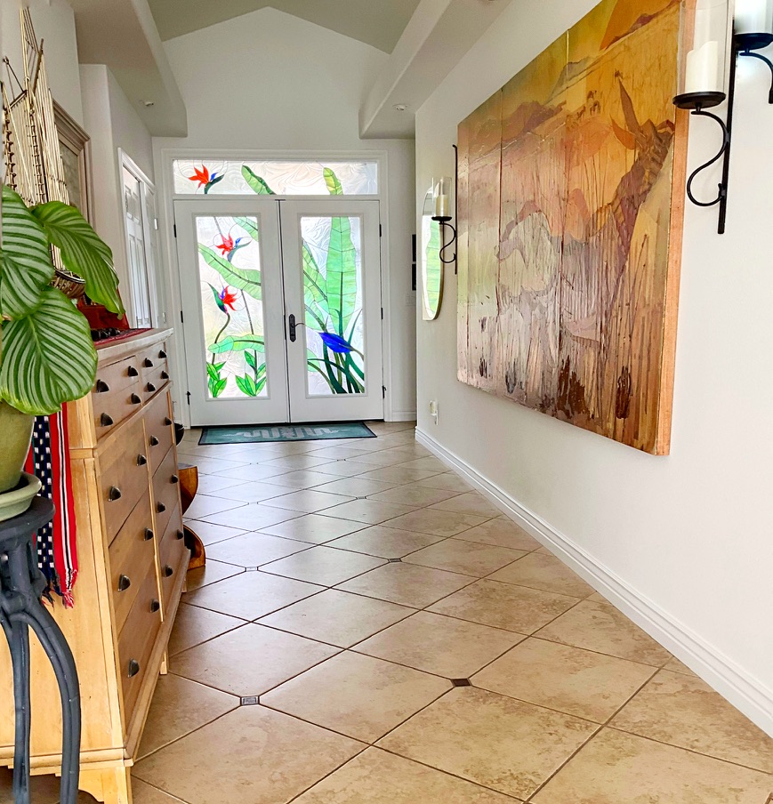
In this hallway the expansive tile floor dominates the visual field. While it may seem counterintuitive, one effective method to cause a color recede is to incorporate it several times throughout the space.
Here we introduced furnishings and artwork three times in tones that match the floor, creating more visual interest. This large piece of art has yellow and gold tones coordinating with the tile, and some reddish tones for interest. Plus, it’s huge! It’s the right scale to fill a long wall.
The large chest of drawers has a gold yellow wood tone, also similar to the floors. The top is the perfect place for the gold sailboat sculpture.
Design Tips: Repeat finishes in threes.
Choose items in the correct scale to draw the eye upward and forward, enhancing the space.
Continuing the concept of repeating in threes we tied in the gold metal sailboat by adding a mirror and print framed in gold.
Now the eye travels from the piece of art, down to the sailboat, and into the main room of the home.
Regardless of the size of your home’s entry, there are always budget-friendly options to enhance its appeal and functionality, creating an inviting first impression.
What challenging area in your space could use easy design solutions?
